Inspector Panel
The Inspector Panel is a crucial component located in the Right Sidebar of the Foxel workspace. Its main purpose is to provide users with the ability to edit the properties of the active object.
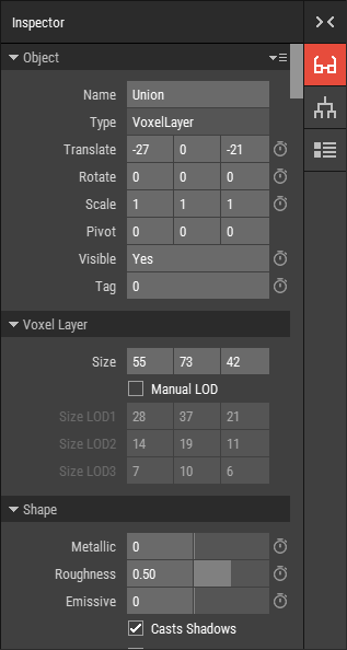 🔺 Figure 1: The Inspector Panel
Key Features
- Edit Object Properties: Modify various properties of the currently selected object. For more information, see Editing Object Properties.
- Asset Property Management: Access and edit properties of the active asset when no object is selected. For more information, see Editing Asset Properties.
- Animation Support: Add animation channels and keyframes directly from the panel. For more information, see Introduction to Keyframe Animation.
Input Fields
Text Input Fields
Text input fields are used to modify text or numeric values.

To change numeric values:
- Directly type the numeric value into the field.
- Middle-click the field and drag left or right to adjust the value.
- Use the
UpandDownarrow keys to change the value in increments of 1. - Hold
Shiftwhile usingUpandDownto change the value in increments of 10. - For float values, use
Ctrl+UpandCtrl+Downto adjust the value in increments of 0.1. - Some fields may also feature a slider for quick adjustments.
When using the slider or middle mouse button, you can hold down Shift to increase the speed of the value change, or Ctrl to decrease the speed.
Index Controls
Index controls allow you to set the index of a color in a Color Palette or a material in a Material Set.

To change an index:
- Type the desired index value directly into the field.
- Or click the button
 to open a window where you can select a color or material.
Color Controls
Color controls enable you to input a color value.

To change a color value:
- Enter the hex value of the color directly into the field.
- Or click the button to open a color picker and choose a color visually.
Boolean Controls
Boolean controls are used to enable or disable specific properties.

If a property can be animated, the boolean control will appear as a text box displaying the values Yes or No. If it cannot be animated, a checkbox will be used instead. Simply click the field or checkbox to toggle the value between enabled and disabled.